
What happened
Last week, China’s state media, Xinhua News Agency, reported that the National Press and Publication Administration and the National Radio and Television Administration jointly launched a dedicated campaign to regulate the use of Chinese characters. According to the notice, authorities nationwide have the right to implement censorship on publications (including packaging and brand campaigns), TV shows, as well as online video and radio programs. The initiative aims to “rectify the problems of incorrect and non-standard use of Chinese characters and to eliminate ‘ugly’ and ‘weird’ font usage which contain vulgar and sloppy exaggerations and deformations in fonts, or violate the writing norms, cultural connotations, and aesthetic standards of Chinese characters.”
The Jing Take
With this new initiative, global brands need to pay more attention to their campaigns, packaging, and ads that involve Chinese fonts. Though characters seem to be an obvious and go-to strategy for brands to leverage in China, they are indeed one of the most difficult elements to design with, especially when it comes to commercial font choices.
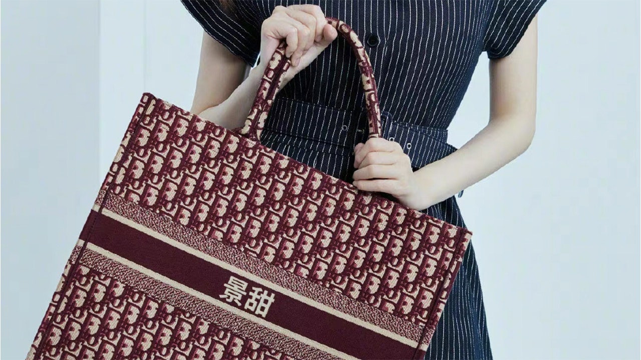
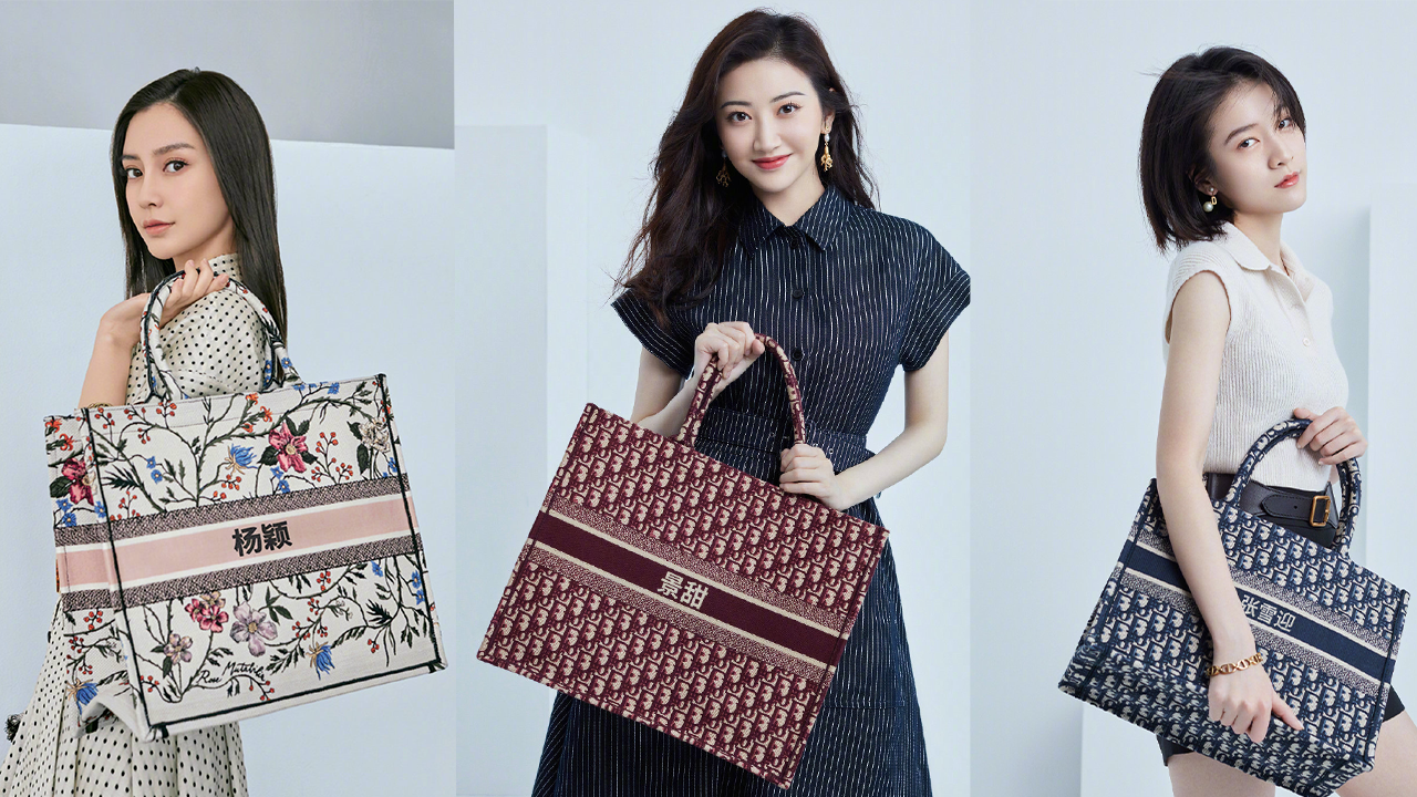
Moreover, using Chinese characters appropriately — as defined by Beijing — can be challenging for luxury fashion houses, as what looks visually appealing may not be inline with Beijing’s proper use guidelines. Take Dior: Two years ago it launched a limited edition of its iconic Book Tote but with an added touch of personalization — Chinese characters. The typeface they used, Source Han Sans, which was invented by Adobe and Google, fell flat with netizens, stating the font looked “clunky,” “weird,” and “feeling like a gimmick to win local consumers.”
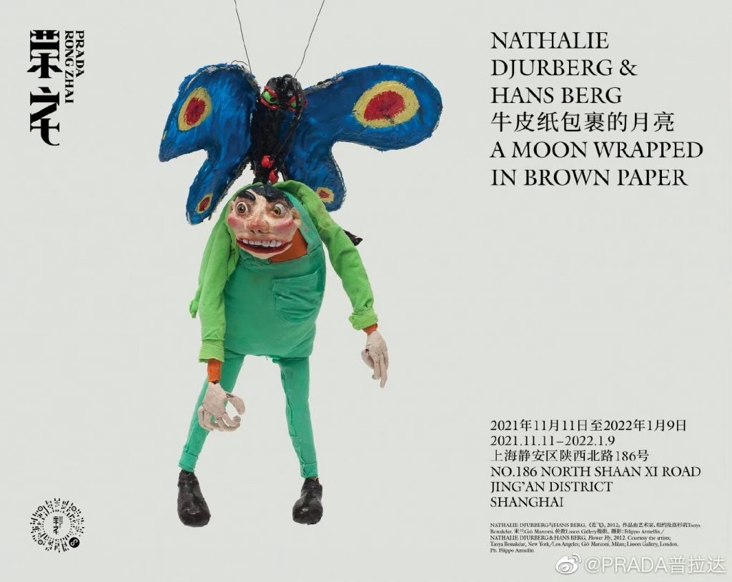
However, there have been successful designs that have been well received. Prada’s logo for their cultural hub, Rong Zhai, is one such example. The font was created by repositioning the length and position of the strokes, which harmoniously merged both Rong Zhai’s historical background and Prada’s modernity that aligned well with the Italian house’s cultural integrity.
To date, however, there isn’t a reliable standard to follow, and there’s a fine line between creativity, especially in luxury marketing, and being inappropriate. International brands need to recognize this and work more closely with their China counterparts to not only send the right message to their customers, but also a message that resonates with the brand. Perhaps easier said than done.
The Jing Take reports on a piece of the leading news and presents our editorial team’s analysis of the key implications for the luxury industry. In the recurring column, we analyze everything from product drops and mergers to heated debate sprouting on Chinese social media.