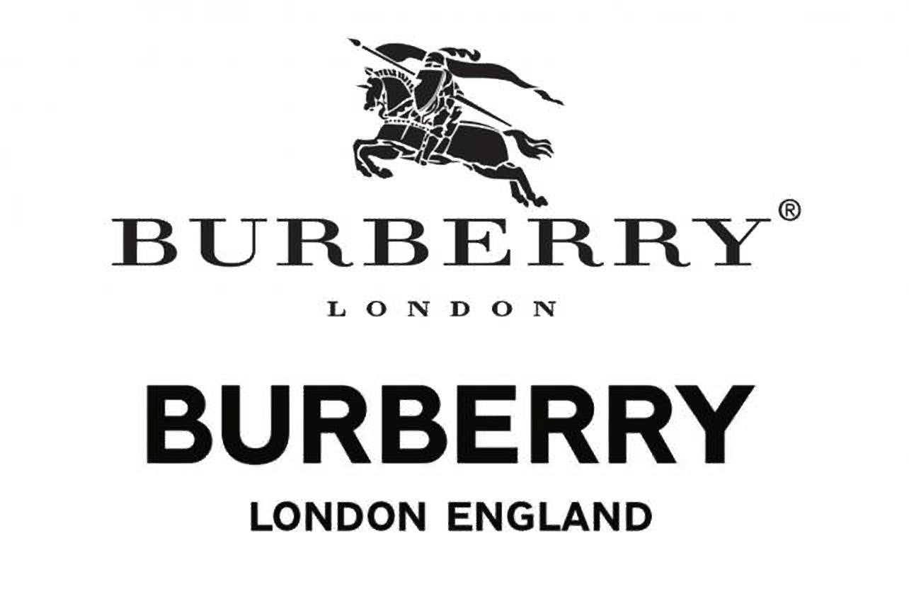
Last week, for the first time in two decades, the British heritage luxury powerhouse Burberry revealed a new logo and monogram. It’s all part of an ambitious rebranding effort under the leadership of new creative chief Ricardo Tisci. The straightforward block lettering, however, has caused a wave of concern among Chinese consumers who worry it is now much easier for the country’s counterfeiters to fake it.
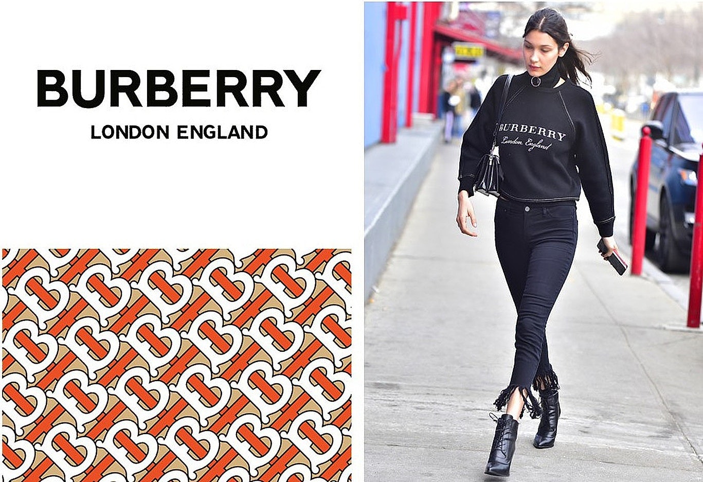
The new logo was designed by British graphic designer Peter Saville, who also redesigned Calvin Klein’s logo previously. Compared to the old version, the new edition drops the Equestrian Knight symbol and replaces the former “Bodoni” font with a bold “san serif” one.
The removal of the complicated Equestrian Knight sign, as well as the use of a font that can be found easily on any design software, is cited by some Chinese consumers a factor that may damage Burberry’s intellectual property rights further.
Fans of the brand took to social media swiftly to express concern. “If I can reproduce this new logo quickly on my laptop, I don’t see it a big problem for any party to reprint it on their items,” wrote one Weibo user named “bachuanhong”.
Another Weibo user “nunu official” argued a complex design is one of the several effective ways for brands to tackle copycats and cited Gucci as an example. He/she wrote, “when luxury brands like Gucci are working on enhancing the level of difficulty in copying their goods through complicated design, Burberry is going the opposite way. Before, not every copycat [could] copy the Equestrian Knight sign perfectly!”
Saville gave an official explanation for the idea behind this new logo, "Historically, Burberry's logotype was appropriate to the trench coat's utilitarian nature. Burberry needed an identity that is fluid and able to cross over into all the categories that are required of a big luxury clothing and accessories brand–something to transcend the company provenance without denying it."
China is one of the biggest counterfeiting markets around the world, accounting for two-thirds of counterfeit products seized globally, according to a report by the Organization for Economic Cooperation and Development (OECD) in 2016. Due to the popularity of Burberry, its signature items have long been reproduced by the country’s unauthorized manufacturing factories, which tend to sell the knock-offs at an extremely lower price.
Fighting back against counterfeiting and knock-off products and gaining more control over the distribution channel of its products is definitely on the agenda of Burberry. In July, the brand was found to have burned up to 37 million worth of items, and the partial reason for that was to avoid the goods flowing into the black market.
One Burberry fan noted that it was too difficult to stem the tide, regardless of the logo. As one user who disagreed with others on Weibo said, “a simple logo does make it (copying) easy, but without it, the fake items of Burberry will not disappear anyway.”
It is also worth noting that the logo used by Burberry over the last two years doesn't have the equestrian knight sign.